Behind the project
The Aesthetic Code of Aline Eremeeff
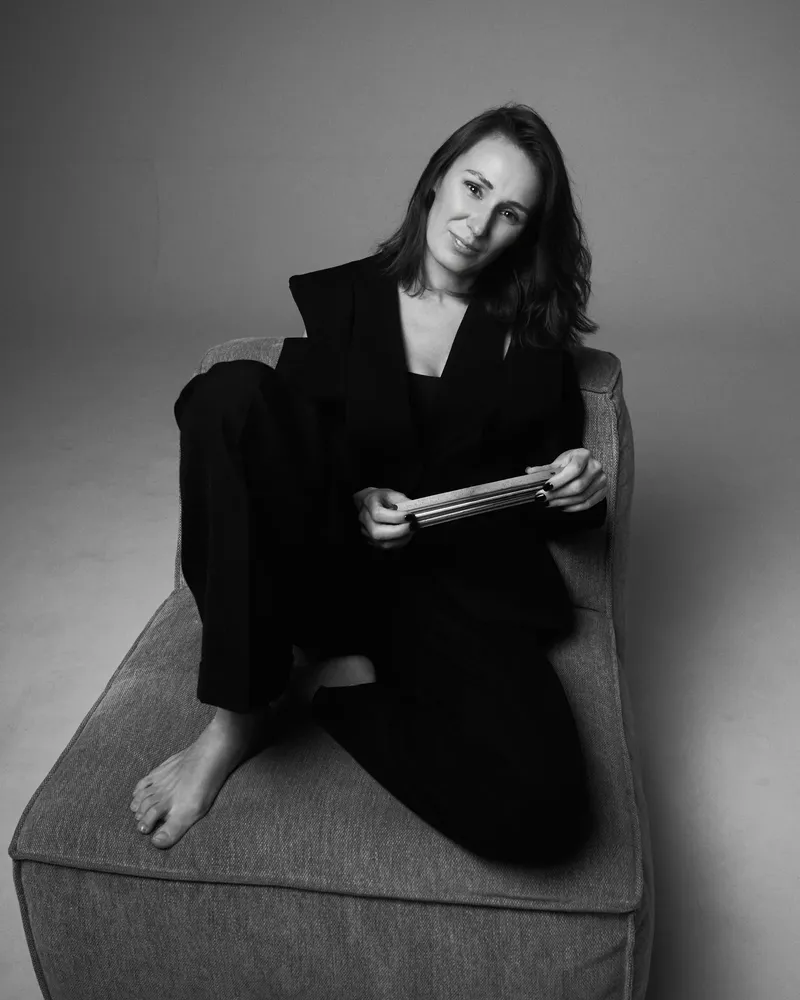
A refined eye is not the ability to pick the most beautiful thing in a room. It is a feeling for the relationships between light, material, proportion and people — and also the discipline to recognise when a designer should enter a space with a clear point of view and when, on the contrary, to step back into the shadows. It is precisely in this tension between authorship and humility that Aline Eremeeff’s interiors are born.
What is remarkable about Aline Eremeeff is that she is intensely present in a project, yet the finished interior never needs to become her own self-portrait. First she observes how a person lives, what they collect, what calms them, where they look when they get up in the morning, how much colour their everyday life can bear, and which objects they carry with them not because they happen to be fashionable, but because they belong to them. Only then does she begin to compose the space, so that her signature is never louder than its owner.
“I try to stay in the shadows, to listen to my client and to take a little look into their values. In my view, an interior should not, at first glance, speak about the designer, but about the person it belongs to. It has happened, for instance, that we began building an art collection of their own for one client’s children. So I never resist when our work naturally extends far beyond the choice of furniture and materials,” says Aline Eremeeff.
Humility, however, does not mean an absence of opinion. Aline can tell very quickly what belongs in a space, and just as unequivocally reject what is beautiful in itself but would disrupt the whole. Karina Svoboda regards precisely this combination of trust and a clear point of view as one of the most valuable qualities of their collaboration.
“I didn’t even hold a selection process. After a single meeting I knew I was entrusting my professional baby to very loyal hands. And it was just as important to me that Aline would not simply approve everything. To several of my proposals she said simply: No. That is exactly the kind of criticism, without ten minutes of explanation, that I had asked her for. It saves me energy and time, and I respect her judgement,” says Karina Svoboda, founder of the developer Vertex Group.
A white that is not just white
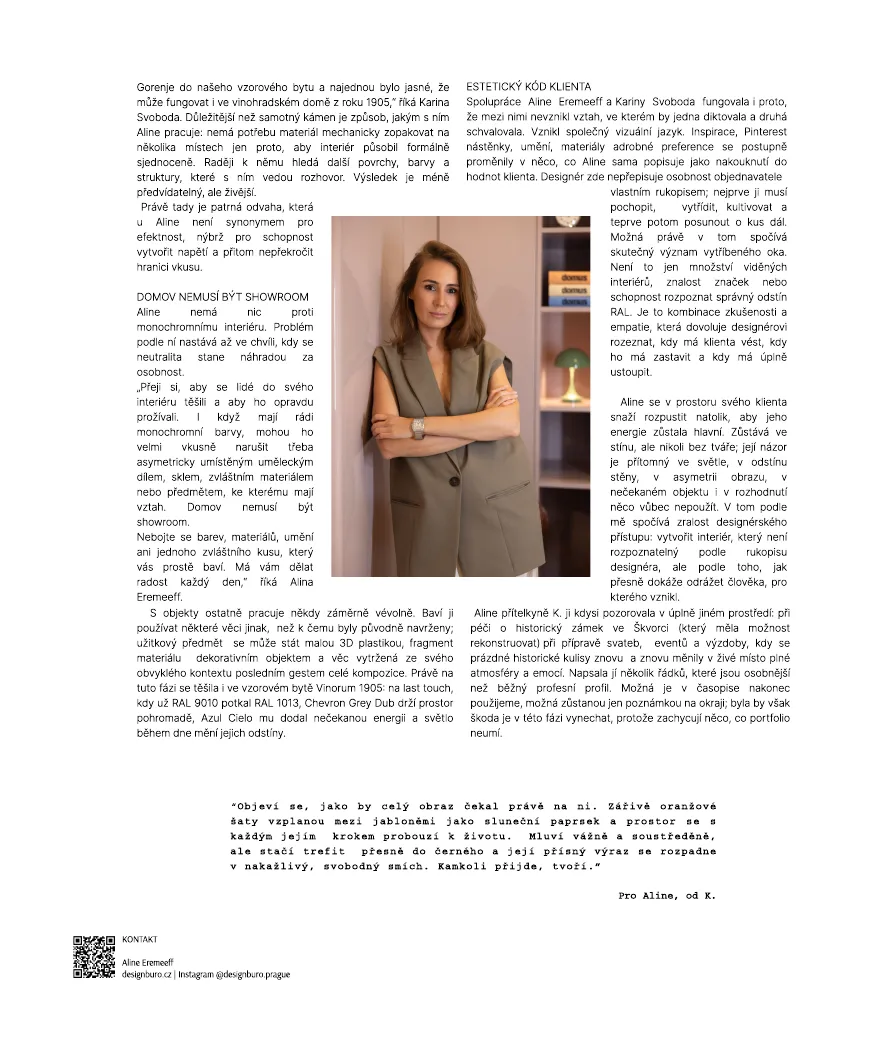
In the show apartment of the Vinorum 1905 Residence, this certainty revealed itself in a seemingly elementary question: white. Aline knew almost immediately that the walls of a historic Vinohrady house could not be given a random developer’s white. The walls were painted in RAL 9016, a softer, slightly warm shade that never feels sterile and responds well to the changes of natural light. Set against it are the restored historic box-type windows in RAL 1013, a delicate ivory tone that belongs naturally to the architecture of a house built in 1905.
“I was fascinated by how precisely Aline saw these relationships. She recognised the shade of our historic windows, RAL 1013, and at the same time knew why they needed RAL 9016 beside them. She didn’t consider a single colour in isolation; even at that moment she saw it together with the floor, the circadian light, the furniture and the art,” adds Karina Svoboda.
The floor called for the same patience. The Chevron Grey Oak shade took a long time to find precisely because it was not meant to be the star of the interior. Its role is more demanding: to create a calm, timeless foundation able to carry furniture of different periods and characters. Grey-toned oak sits as naturally beneath a soft contemporary sofa as beneath a vintage statement piece, a mid-century object, a striking lamp or modern art. The floor, then, does not prescribe a single style; it leaves the future owner free to layer the interior and let it change over time.
This is one of the differences between decorating a room for a photograph and designing a home. A photograph captures a moment; a good foundation has to survive a life.
Light as part of the rhythm of life
Aline does not read a space only in centimetres and materials. She is interested in where natural light comes from, when it appears in a room and how its energy shifts over the course of the day. In the west-facing show apartment, the lighting concept is therefore not merely a matter of choosing fittings. In the morning, when there is less natural light, artificial lighting can work with a more active temperature of roughly 3500 to 4500 K, settle down during the day and, in the evening, gradually shift to a warm 2700 K.
Terms such as circadian lighting, wellbeing or biohacking sound almost obligatory today, yet their real meaning is surprisingly simple: a home should help us wake up in the morning and, in the evening, allow us to slow down. We can invest in mattresses, sleep apps and wellness routines, but if we spend several hours before bed under light that keeps telling the body it is noon, something is missing from the idea of lifestyle balance. A well-designed interior does not comment on such things; it simply resolves them quietly.
Azul Cielo: courage that does not shout
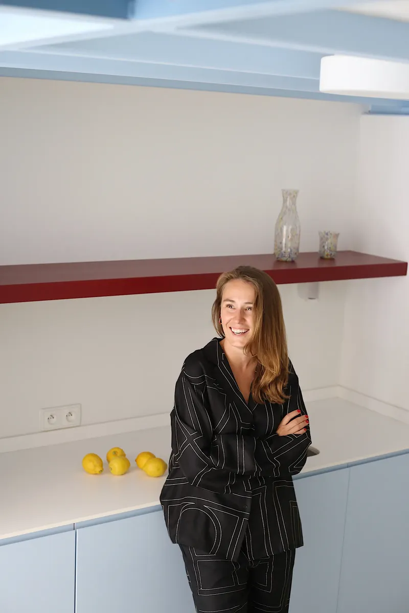
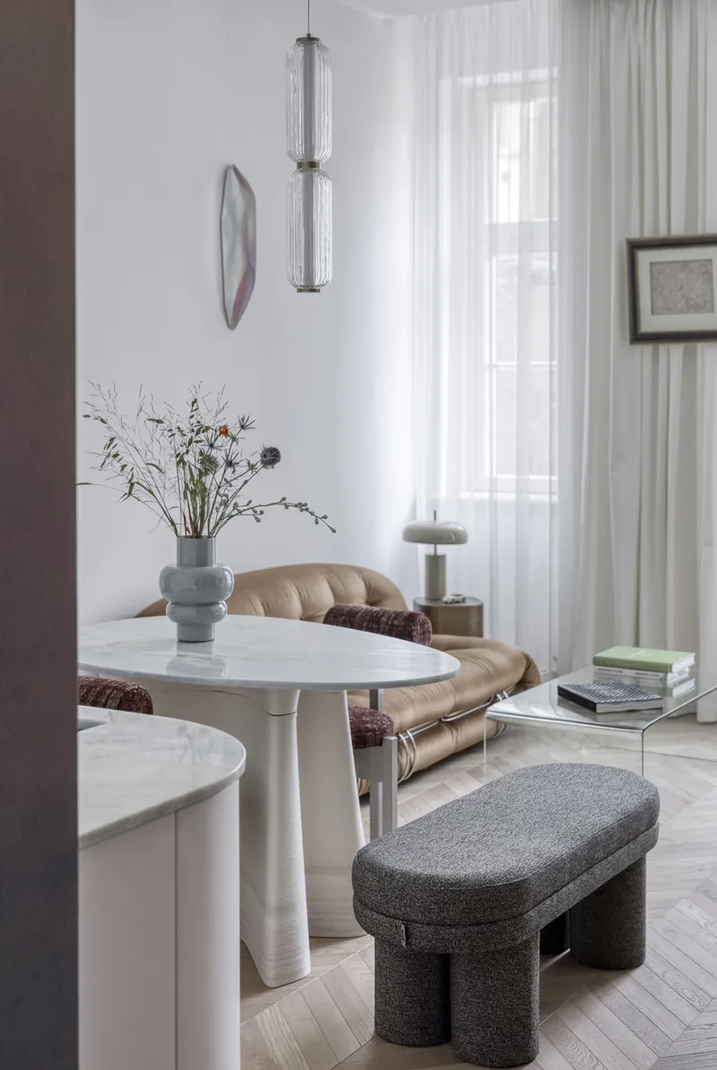
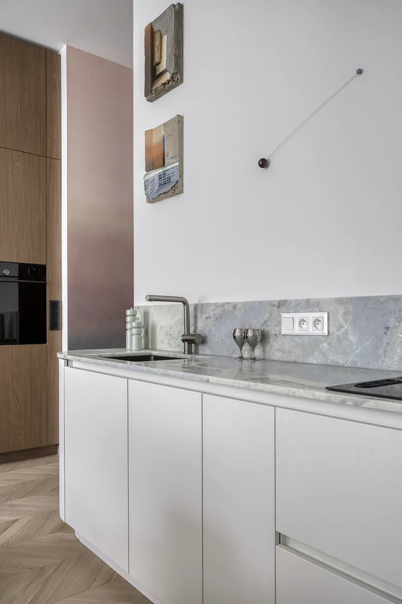
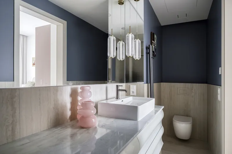
A calm foundation, though, needs a moment that gives the interior personality. One such decision was Azul Cielo stone from KNF Marble. Its pale sky blue is one of those materials that can easily become an attraction for its own sake if handled without restraint. Aline, by contrast, saw in it a precisely controlled accent, and began to build relationships around it with pale blue, neutral and natural tones.
“I was convinced that a pale blue like this could only work in the CELINE showroom in Miami. Aline brought it onto the Gorenje kitchen in our show apartment, and suddenly it was clear that it could work in a 1905 Vinohrady house too,” says Karina Svoboda. More important than the stone itself is the way Aline works with it: she feels no need to repeat a material mechanically in several places simply to make an interior look formally unified. She would rather look for other surfaces, colours and textures that enter into a conversation with it.
The result is less predictable, but more alive. And this is where her courage shows — for Aline, courage is not a synonym for showiness, but for the ability to create tension without crossing the line of good taste.
A home need not be a showroom
Aline has nothing against a monochrome interior. In her view, the problem arises only when neutrality becomes a substitute for personality.
“I want people to look forward to their interior and to truly live in it. Even if they love monochrome colours, they can break it up very tastefully — with an asymmetrically placed work of art, with glass, an unusual material or an object they feel attached to. A home need not be a showroom. Don’t be afraid of colour, materials, art, or of one curious piece that simply delights you. It should give you joy every day,” says Aline Eremeeff.
With objects, indeed, she sometimes works with deliberate wilfulness. She enjoys using things differently from what they were originally designed for: a utilitarian object can become a small sculpture, a fragment of material a decorative object, and a thing taken out of its usual context the final gesture of the whole composition. This was the stage she was looking forward to in the Vinorum 1905 show apartment, too: the last touch, when RAL 9016 has already met RAL 1013, Chevron Grey Oak holds the space together, Azul Cielo has lent it unexpected energy and the light alters their shades through the day. Only then come the last few things, which no longer need to solve anything practical. They are there to bring the space to life.
The client’s aesthetic code
The collaboration between Aline Eremeeff and Karina Svoboda worked also because theirs never became a relationship in which one dictated and the other approved. A shared visual language emerged instead. Inspiration, Pinterest boards, art, materials and small preferences gradually turned into something Aline herself describes as a glimpse into the client’s values. Here the designer does not overwrite the client’s personality with her own signature; she must first understand it, sort it, refine it — and only then take it a step further.
Perhaps this is where the true meaning of a refined eye lies. It is not just the number of interiors seen, a knowledge of brands or the ability to recognise the right RAL shade. It is a combination of experience and empathy that allows a designer to tell when to lead the client, when to stop them and when to step back entirely. Aline tries to dissolve into her client’s space to such an extent that their energy remains the main one. She stays in the shadows, but not without a face; her point of view is present in the light, in the shade of a wall, in the asymmetry of a picture, in an unexpected object — and in the decision not to use something at all.
A place that comes to life
Aline’s friend K. once watched her in an entirely different setting: caring for the historic chateau in Škvorec (which she had the opportunity to restore), preparing weddings, events and decorations, as the empty historic backdrop was transformed, again and again, into a living place. She wrote her a few lines that are more personal than a usual professional profile. Perhaps we will use them in the magazine in the end, perhaps they will remain only a note in the margin; but it would be a pity to leave them out at this stage, because they capture something a portfolio cannot.
For Aline, from K.
She appears as though the whole picture had been waiting for her alone. A brilliant orange summer dress from Barcelona flares among the apple trees like a ray of sunlight that has strayed into the orchard by chance. She walks slowly and with assurance, her long arms drawing in the air as if conducting the space itself, and with each of her steps the space seems obediently to rearrange itself.
Men begin to move in her orbit, not because she commands them to, but because in her presence it seems the most natural order of things. The apple trees sway lazily, the wind runs through her hair and plays with the light fabric of her dress. A moment ago this was just an empty apple orchard; now it is a celebration.
She has a rare gift for stepping into an ordinary place and waking it to life. Out of emptiness comes a living space, out of chance comes order, and out of an orchard a story. She builds, adorns and gathers people around her as lightly as the wind folds the fabric of her dress.
She speaks seriously, almost sternly, and at such moments it seems a smile hardly belongs to her. Yet it is enough for someone to hit the mark exactly, and suddenly she bursts into infectious laughter — loud, free, head thrown back, so sincere that her whole stern image crumbles in a single instant.
And then you understand: wherever she goes, she creates.
Perhaps this last sentence describes Aline Eremeeff most precisely. Her aesthetic code is neither monochrome nor colour, neither historicism nor contemporary minimalism, neither precious stone nor vintage object. It is a way of working that begins with a very attentive reading of a person and ends at the moment when the designer is able to step back. To stay in the shadows, but with a clear point of view; to create an interior strong enough to have character, and at the same time humble enough for someone else to live in it to the full.
Instagram Design Buro


Printed edition
Related articles
 Housewarming gifts by Aline EremeeffA new home deserves something more than a merely practical trinket. As an interior designer, I have chosen objects that can lend a space…
 Kitchen design without the stressMain partner for kitchens and built-in wardrobes: DOT kuchyně Gorenje studio Vinohradská
 A chevron we spent a long time searching forThe detail that holds the whole together